Vikram Singh
time wounds all heels
  • About Me
  • UX
  • Photography
  • Blog
  • Contact Me
Author

Vikram

Vikram

Case Studies

From Video Chaska to Sony Liv – Story of a website re-design

by Vikram 4 years ago
written by Vikram

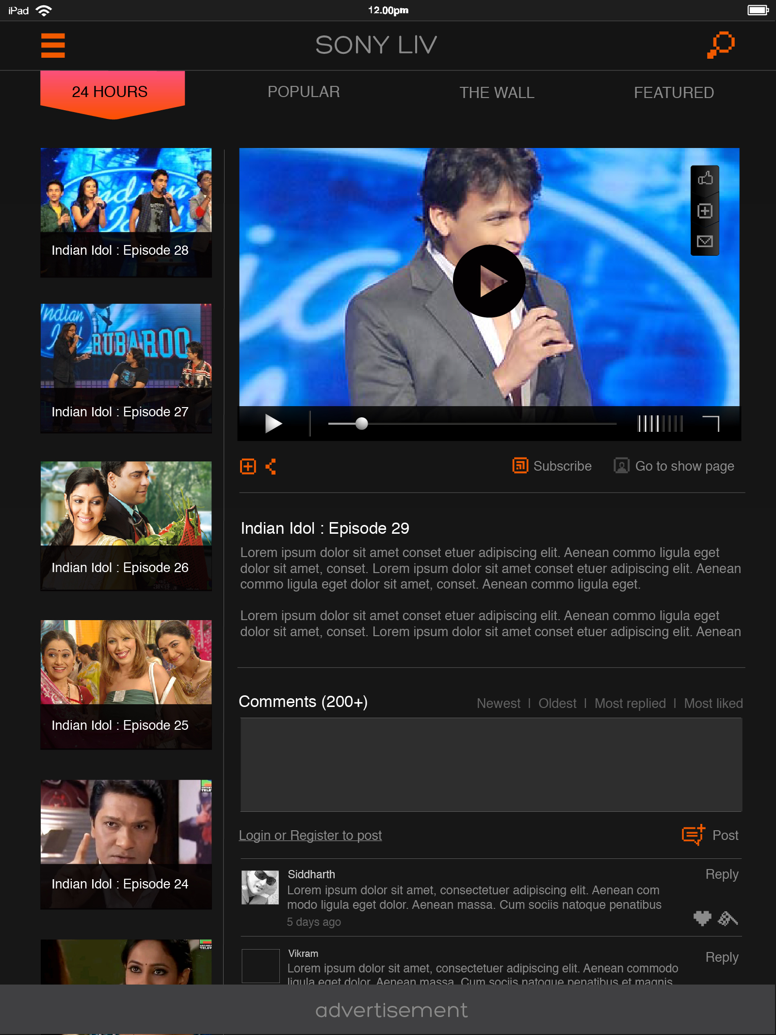
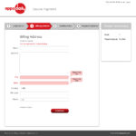
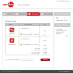
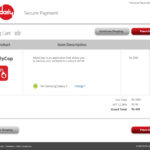
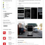
When Sony TV, India lanuched their new channel Sonty LIV, they contacted Maya Studios for the UX desgin problem. The pain point we had to solve were as follows:

  • Sonay had an existing IP called Video Chaska, which hosted all their content (15k+ hours of video), how to help user discover more content
  • How to transitions smoothly from Video Chsaka to Sony LIV without major disruptions?
  • Desing for connectede experience across web, mobile and tablets. 

We designed the site in a way that would cause minimum disruption to the experience of existing users, prepared a content strategy for the marketing team on how can they prepare users for the transition. And lastly, designed several upsell widgets/CTAs for content discovery.

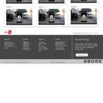
Original SonyLiv site before the Re-design
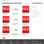
Project Images

Project Files

  • PDF icon sonyliv_website_wireframes.pdf
  • PDF icon sonyliv_tablet_wireframes.pdf
  • PDF icon sonyliv_mobileapp_wireframes.pdf
  • PDF icon videochaska_feature_list_webportal_and_mobile_app.pdf
  • File sony_functionality_hcl_doc_2.docx
  • File sony_feedback_4.docx
  • File sony_feedback_5.docx
  • File sony_feedback.docx
  • File sony_feedback_2.docx
  • File sony_feedback_3.docx
  • File data_for_sony_presentation.pptx
4 years ago 0 comment
0 FacebookTwitterLinkedin
Blog

Changing Education Paradigms

by Vikram 4 years ago
written by Vikram
https://youtu.be/zDZFcDGpL4U

Sir Ken Robinson once again at it. I am grateful that my design school (NID) recognized that intrinsically and give so much freedom to all of us. This video is kind of key to clearing NID entrance exams. 🙂

4 years ago 0 comment
0 FacebookTwitterLinkedin
Case Studies

Apps Daily – App Store Design

by Vikram 4 years ago
written by Vikram
Apps Daily World home page image.

Project Images

Project Files

  • File mayastudios_flipkart_shopping_experience.pptx
  • Office presentation icon maya_presentation_aapstores.ppt
  • PDF icon appsdaily_wireframes.pdf
  • PDF icon appsdaily_questions_for_claryity_by_mayastudios.pdf
  • Package icon appsdaily_mindmap.zip
4 years ago 0 comment
0 FacebookTwitterLinkedin
Uncategorized

About Anger

by Vikram 4 years ago
written by Vikram

Anger is neigher created nor destroyed
Anger  changes medium…

4 years ago 0 comment
0 FacebookTwitterLinkedin
Uncategorized

A time to recall the stalwarts

by Vikram 4 years ago
written by Vikram

Does anyone remember Maulana Azad and Rafi Ahmed Kidwai anymore?

The frenzied debate over the comparative legacies of Jawaharlal Nehru and Sardar Vallabhbhai Patel, sparked by Narendra Modi’s foray into counter-factual history, provides an occasion to remember two tall Congress leaders whose contribution to the idea of a modern, united and secular India has gone by default because there are no votes to be had by invoking their names.

Continue Reading on The Hindu.
Photo Courtsy – The Hindu

4 years ago 0 comment
0 FacebookTwitterLinkedin
Uncategorized

Authorify by Smart Agents

by Vikram 5 years ago
written by Vikram

Smart Agents is US based company which provides domain specific books for licensing, personalization and publication to high end real estate agents who want to stand apart from the competition. Using these books customers can build trust, show they are knowledgeable and increase their commissions.

Situation

Being a brick and mortar company, Smart Agents had to do the entire sales, marketing, customer on-boarding, book section and personalization offline which required a lot of man power and customer fatigue. Thus, Authorify was born as a separate online venture by Smart Agents. Authorify was meant to resolve many problems caused by the offline nature of Smart Agents and add more features and possibilities to the mix. Authorify offering can be described as flows:Authorify is an online platform that facilitates the process for a Real Estate agent to license pre-written Real Estate books. The agent will be able to customize the book covers with their branding (headshot, logo, etc). The platform will also be responsible for facilitating purchases and back office workflows related to purchases. Functionality like automated creation of landing pages for agents and the ability to customize the content within the books will be added in future. The platform is expected to expand into new markets unrelated to Real Estate in the future.

Tasks / Challenges

  • No existing design resource available. We had to be hands on from the start.
  • Offline user journey broke down due to logistical issues, scheduling issues between customer and agents, lack of documents, quality of pictures, etc. Fix these.
  • Abandoned subscriptions – due to customer guilt, fatigue, fear of complexities, took too much time, etc.
  • We joined the project mid way, when primary research, functional requirements, MVP features were all decided and done. Dev team had already started building an interface based on a popular web service. Bottom line, there was no time to waste and make do with all that was already been done.
  • We had to analyse, validate, question and confirm earlier work and align it with actual business objectives.
  • Build consensus between the stakeholders at Smart Agents and Accionlabs team (MVP was loaded with features).
  • Find productive and suitable tasks for Dev team while initial design research and rationalization was happening.

Actions

  • Design review of the existing research and documentation
  • Secondary research
  • Competivie research
  • Client workshop
  • Customer interview
  • MVP feature rationalization
  • Wireframing
  • Visual Design
  • Prototyping, Testing & Iteration

Results

  • Smart Agents launched Authorify in late 2019
  • Some unique features suggested by us have become more profitable than the core offering
  • Membership model simplified
  • Praise from the client and users
  • 50% reduction in customer drop-off
  • Customer has engaged Accionlabs for next phase of development

Project Files

  • PDF icon authorify_wireframes_v3.pdf
  • PDF icon authorify_wireframes_v8.pdf
  • PDF icon authorify_wireframes_v9.pdf
  • PDF icon authorify_wireframes_v13.pdf
  • Microsoft Office document icon creative_brief_authorify_stake_holder_replies.doc
  • File authorify_functional_requirements.docx
  • PDF icon authorify_notes_book_1.pdf
5 years ago 0 comment
0 FacebookTwitterLinkedin
Case Studies

How to dissect an app for UX

by Vikram 6 years ago
written by Vikram

Confronted with a new interface? How would you go about dissecting it as a UX designer? Here is my take on a sample interface (watch the 4 minute video first).

General Observations

Below are some quick insights that I could glean from the brief demo. Element wise observations are given in the respective heads further down in the article. I’ve knowingly not used Heuristic evaluation as I wanted to keep a broader outlook and not be just usability focused.

  • Interaction model – The first and the most striking aspect of the application for me is the complete and total lack of a cohesive interaction model. Due to this the elements in the application are arranged mechanically lacking any overarching narrative. Since this is an enterprise class application, lack of proper interaction model or adherence to users mental model leads to an application that user find hard to use, unhelpful and error prone. All of this is very costly in an enterprise environment.
  • Interaction Design – IxD issues are an extension of the problems arising from the absence of an interaction model. Tasks have not been studied thoroughly hence lack an intuitive and cohesive flow. For example, regularization of attendance requires HR reminder and even then user has no way to know if attendance for a particular date has been regularized by him or not. Helpful links to do so are missing on the attendance page and the entire regularization task takes place in a pop-up form!
  • Information Architecture – poor IA can be seen at different places. For example, badly placed and functionally different action buttons placed in the header of the pace, or poor or uninformative labelling of UI elements like LHS information blocks, titles and sub headings.
  • Communication Design – This is an oft neglected area in UX design especially in enterprise level applications. This is the case here as well. There is no copy or explanation text in the interface, not just that the grammar is not consistent and the choice of labels and titles is too spare and unhelpful. A well written copy and good labelling system is foundational to good UX.
  • Visual Design – Visual design again is not very well structured. Use of icons, button colors, title alignments etc., are not cohesive. Alignments of visual elements such as icons and their associated badges are off. Icons are not even from the same family. Overall, the VD is pretty dated and the look and feel is not very appealing for an interface that will see mandatory and repeated use almost every day by its users.
  • UI Principals – The entire UX violates (in various degrees) several UI design principals such as, Structure, Simplicity, Visibility, Feedback, Tolerance and Reuse. Of these, the most egregious violations of the said rules is of the tolerance and reuse. At several places in the demo we can see how the user is exasperated that obvious mistakes lead to redoing of the task at hand. Mauling of reuse principal of UI design is even more glaring. Lack of consistency in the use of UI components, data formats, input gathering etc., can be seen through out the interface. For example date and time formats are different in different places and input fields.


About the user/narrator

Following are the insights on the narrator and the general sense I get about other users of the system as communicated by the narrator. These are mere inferences and in real life scenarios there will be more information to validate these.

  • Narrator is a good communicator, probably in his late 20s to early 30s, male from upper middle class background. Most probably hails form a large urban city. He’s experienced with the system so it seems he’s been with the organization at least a couple of years.
  • Narrator fits the ideal person of a power user so he’s a good candidate for a stakeholder interview and even contextual inquiry.
  • Based on the demo, we can assume the users find this system tedious to work with and make many mistakes. They probably need help in finding how to perform tasks assigned to them.
  • The organization is definitely losing productivity due to this system and probably some users, especially senior management, altogether skip using it. This might be leading to compliance issues and data inconsistency issues.
  • The system does not fully map out all the use cases and how people actually work, hence leading to partial automation of routine tasks such as attendance regularization (remember the user was reminded by the HR to update his time sheets).
  • This is probably a legacy system designed and developed without UX inputs.

Header

  • Logo alignment wonky as its not aligned with the inner LHS area container. Too flush to the left.
  • Unclear what the clock icon does in the header?
    • Is it part of the search component or is it free standing?
  • Primary or action buttons (Clock out & Request) are placed in an unusual place and with inconsistent trigger actions. One button initiates a multi-step task popup and the other is a drop down menu. There is no context supplied to these buttons. Also the two buttons are misaligned. More specifically –
    • Clock Out button
      • Choice of button color, in Indian context, implies a negative action.
      • Clocking out is a core task, placing it with another equally important button (which is a menu as well), makes it compete for attention.
    • Request Button
      • It is being used as a menu item so its placement is wrong/questionable.
      • Since this is a drop down menu list with multiple items, the button label is semantically wrong. It should be Requests.
      • Drop down menu item “Attendance” is a bad label choice, as it does not indicate that it will help the user update his attendance.
      • Drop down menu item “Reimbursement” seems to be a duplicate of the main menu item. If so, then its a poor redundancy and if not then its even worse.
    • Search Box
      • Too prominent as its placed right in the middle of the header. The question is, is this functionality so important? Is there sufficient data to justify this decision?
      • It clashes with the search box in the main content area.
      • Component height seems to be slightly greater than the action buttons.
      • Place holder text – Colleagues, Groups and Tags
        • Text looks too much like normal body text, usually placeholder text is slightly greyed out. Wrong affordance.
        • It emphasises searching of items that are not represented on the rest of the page, so the question is, shouldn’t there be a more relevant text to encourage the users?
  • Misaligned icons and their associated badges, probably a simple CSS issue.
  • Inconsistent use to icons, clipart icons mixed with round profile icon.

Main menu (navbar)

  • Low readability due to low color contrast, choice of font weight and style.
  • Clipart icons used and even those are inconsistently used for different items.
  • What does the speedometer icon denote? Is it part of the menu choices? Or it is just a static image? Why is it there?
  • RHS icon looks like it represents help section of the application. If so, this is unusual, if not inconsistent usage.
    • If its a menu item, then why is it an icon? Why not icon+button scheme for it?
  • Questionable grammar – should it be Reimbursement or Reimbursements?
  • Streams seems to be the duplicate of the first icon in header’s secondary menu. If so then why this redundancy?

Left Hand Column

  • LHS items have poor space utilization, not really helping in readability.
  • Poor copy or labels for example, Total duration, Average duration, etc.
  • Unnecessary to show seconds in the time display. They are just making the display more complex, besides being inconsistent from the rest of the application.
  • The right aligned labels are not consistent with rest of the application, left hand alignment would be better.

Main Content Area

  • Redundant sub heading as the list boxes on the right already show the selected month/year. This is an example issues that arise due to lack of communication design inputs.
  • the drop downs / list boxes are far away from the sub heading to create a proximity association, necessitating redundancy of the title. Not good UI design.
  • Do we really need two drop downs to select year/month? Wouldn’t a date component do a better job with better usability?
  • Why does month selection drop down has year as well?
  • Not clear why there is a search box. By design only a months worth of records can be displayed (due to the drop downs), which means showing 20 to 25 rows at max, making the search box necessary. If its a global search box then too the search box is redundant and not required as there’s a global search box in the header.
  • For the same reason, next/previous buttons seem unnecessary for such a small list of items. They also look as if they are in active state, for a list with no pagination, these should have been at least in disabled state. And they are misaligned to boot!
  • Time stamps have been unnecessarily been made too complex by including seconds. Besides, this time scheme is not used elsewhere in the system bringing in inconsistency.
  • Same with date format. The user already knows, moth and year, is this information being repeatedly shown in the listing? All in all, this is a poor choice of format.
  • Assuming this is the default screen when you come to this page, shouldn’t it display this fact? Further, since the users have to typically update previous months attendance, shouldn’t this page display the same or at least a list of days that need to be reviewed by the user?
  • There is no way for the user to request attendance regularization from this page. Seems like an obvious option to me. A simple edit button should suffice.
  • Status column makes little sense. After all, when a user is absent the row for that day can be disabled or visually different (no login/logout times, etc), so why have this column?

Attendance Request popup

  • For such a core taks, popup interface seems odd, especially because this potentially a multi-step complex task. Poor interaction design.
  • Web clock-in seems like an important task, should it be hidden inside a popup?
  • Poor selection of default value for Location field as most people can be safely expected to work from office by default.
  • The date label “01” is unclear and doesn’t communicate what its for. Lack of proper copy and poor labelling. Same issue with “Add More” link.
  • The user said, he forgot to Clock-out on 5th, so the “Clock-in Time” should be have been automatically populated by the system with his clock-in time as soon as he selected the date. Same when a user simply wants to update/fine-tune his timing. This could save a lot of steps at the organization level as well as reducing data corruption/inconsistency issues.
  • No cancel button.
  • The date picker does not give the affordance of a date component.
  • The time picker components are not standard and too complex. Any modern date/time picker component would do a better job with vastly improved usability. Also, time format in these fields are different from the logs view page. That’s bad either stick to 24 hour format or AM/PM.
  • The time entry fields for hours and minutes have default text as “–Select–” instead of “hour”, “minutes”. Bad usability.
  • Any why is the user made to enable these fields? Aren’t these mandatory fields!
  • The heading “Overnight Clock-out” seems redundant, the check box component and its label give sufficient explanation.
  • Message field is mandatory but has no indication for the same.
  • No visual separation between form/apples for different days. Its a minor point but can be important if the user has to work with multiple days. Poor usability/visual design.
  • With the addition of multiple days, the popup becomes harder to navigate, especially by keyboard and also looks too complex.
  • The “X” button used in the applets is to remove that day from the form (I am assuming), but this is bad affordance. Such buttons are usually used to close components, especially when placed in the upper right corner. Also, the small size of the button is bad for usability (Fitts law).
  • Furthermore, it clashes with the close button of the popup itself!
  • Listening to the user/narrator it seems that the form discards already entered data when there’s an error. This should not happen in a well designed application.
  • The system does not reflect how things are already done in the organization. For example, in date “03”, upon form submission, the system informs the user that this date has already been approved. This will never happen in a properly researched and full automated system.
  • In the above example, “03” the narrator is not sure if the above is system mistake, a miss communication or human error. This shows lack of proper system research and consequently lack of automation and proper feedback.

Thanks it!

6 years ago 0 comment
0 FacebookTwitterLinkedin
Case Studies

Roleplaying Workshop – 2018

by Vikram 6 years ago
written by Vikram
6 years ago 0 comment
0 FacebookTwitterLinkedin
Blog

Why wireframes are dying – A talk (teaser)

by Vikram 6 years ago
written by Vikram

Small teaser video of a conference talk I gave at Accion Innovation summit, Goa 2019. Head to Accionlabs website for full talk.

6 years ago 0 comment
0 FacebookTwitterLinkedin
Case Studies

UX Workshop for Designers – Banglore 2019

by Vikram 7 years ago
written by Vikram

7 years ago 0 comment
0 FacebookTwitterLinkedin
Newer Posts
Older Posts
  • Articles
  • Blog
  • Case Studies
  • Uncategorized
  • Web videos

Instagram

Recent Posts

  • From Video Chaska to Sony Liv – Story of a website re-design

    4 years ago
  • Changing Education Paradigms

    4 years ago
  • Apps Daily – App Store Design

    4 years ago
  • About Anger

    4 years ago
  • A time to recall the stalwarts

    4 years ago

Popular Posts

  • Text Book Usability Issues

    19 years ago
  • Mahindra & Mahindra XUV 500 – Car Infotainment System

    13 years ago
  • Salute to the great man

    15 years ago

Instagram

  • Instagram
  • Linkedin
  • Flickr
Footer Logo
  • About Me
  • Blog
  • Contact Me
  • Home Page
  • Photography
  • UX

@2025 - All Right Reserved.


Back To Top
Vikram Singh
  • About Me
  • UX
  • Photography
  • Blog
  • Contact Me