How to dissect an app for UX
Confronted with a new interface? How would you go about dissecting it as a UX designer? Here is my take on a sample interface (watch the 4 minute video first).
https://vimeo.com/441437375
General Observations
Below are some quick insights that I could glean from the brief demo. Element wise observations are given in the respective heads further down in the article. I’ve knowingly not used Heuristic evaluation as I wanted to keep a broader outlook and not be just usability focused.
- Interaction model - The first and the most striking aspect of the application for me is the complete and total lack of a cohesive interaction model. Due to this the elements in the application are arranged mechanically lacking any overarching narrative. Since this is an enterprise class application, lack of proper interaction model or adherence to users mental model leads to an application that user find hard to use, unhelpful and error prone. All of this is very costly in an enterprise environment.
- Interaction Design - IxD issues are an extension of the problems arising from the absence of an interaction model. Tasks have not been studied thoroughly hence lack an intuitive and cohesive flow. For example, regularization of attendance requires HR reminder and even then user has no way to know if attendance for a particular date has been regularized by him or not. Helpful links to do so are missing on the attendance page and the entire regularization task takes place in a pop-up form!
- Information Architecture - poor IA can be seen at different places. For example, badly placed and functionally different action buttons placed in the header of the pace, or poor or uninformative labelling of UI elements like LHS information blocks, titles and sub headings.
- Communication Design - This is an oft neglected area in UX design especially in enterprise level applications. This is the case here as well. There is no copy or explanation text in the interface, not just that the grammar is not consistent and the choice of labels and titles is too spare and unhelpful. A well written copy and good labelling system is foundational to good UX.
- Visual Design – Visual design again is not very well structured. Use of icons, button colors, title alignments etc., are not cohesive. Alignments of visual elements such as icons and their associated badges are off. Icons are not even from the same family. Overall, the VD is pretty dated and the look and feel is not very appealing for an interface that will see mandatory and repeated use almost every day by its users.
- UI Principals - The entire UX violates (in various degrees) several UI design principals such as, Structure, Simplicity, Visibility, Feedback, Tolerance and Reuse. Of these, the most egregious violations of the said rules is of the tolerance and reuse. At several places in the demo we can see how the user is exasperated that obvious mistakes lead to redoing of the task at hand. Mauling of reuse principal of UI design is even more glaring. Lack of consistency in the use of UI components, data formats, input gathering etc., can be seen through out the interface. For example date and time formats are different in different places and input fields.
About the user/narrator
Following are the insights on the narrator and the general sense I get about other users of the system as communicated by the narrator. These are mere inferences and in real life scenarios there will be more information to validate these.
- Narrator is a good communicator, probably in his late 20s to early 30s, male from upper middle class background. Most probably hails form a large urban city. He’s experienced with the system so it seems he’s been with the organization at least a couple of years.
- Narrator fits the ideal person of a power user so he’s a good candidate for a stakeholder interview and even contextual inquiry.
- Based on the demo, we can assume the users find this system tedious to work with and make many mistakes. They probably need help in finding how to perform tasks assigned to them.
- The organization is definitely losing productivity due to this system and probably some users, especially senior management, altogether skip using it. This might be leading to compliance issues and data inconsistency issues.
- The system does not fully map out all the use cases and how people actually work, hence leading to partial automation of routine tasks such as attendance regularization (remember the user was reminded by the HR to update his time sheets).
- This is probably a legacy system designed and developed without UX inputs.
Header
- Logo alignment wonky as its not aligned with the inner LHS area container. Too flush to the left.
- Unclear what the clock icon does in the header?
- Is it part of the search component or is it free standing?
- Primary or action buttons (Clock out & Request) are placed in an unusual place and with inconsistent trigger actions. One button initiates a multi-step task popup and the other is a drop down menu. There is no context supplied to these buttons. Also the two buttons are misaligned. More specifically -
- Clock Out button
- Choice of button color, in Indian context, implies a negative action.
- Clocking out is a core task, placing it with another equally important button (which is a menu as well), makes it compete for attention.
- Request Button
- It is being used as a menu item so its placement is wrong/questionable.
- Since this is a drop down menu list with multiple items, the button label is semantically wrong. It should be Requests.
- Drop down menu item “Attendance” is a bad label choice, as it does not indicate that it will help the user update his attendance.
- Drop down menu item “Reimbursement” seems to be a duplicate of the main menu item. If so, then its a poor redundancy and if not then its even worse.
- Search Box
- Too prominent as its placed right in the middle of the header. The question is, is this functionality so important? Is there sufficient data to justify this decision?
- It clashes with the search box in the main content area.
- Component height seems to be slightly greater than the action buttons.
- Place holder text - Colleagues, Groups and Tags
- Text looks too much like normal body text, usually placeholder text is slightly greyed out. Wrong affordance.
- It emphasises searching of items that are not represented on the rest of the page, so the question is, shouldn’t there be a more relevant text to encourage the users?
- Clock Out button
- Misaligned icons and their associated badges, probably a simple CSS issue.
- Inconsistent use to icons, clipart icons mixed with round profile icon.
Main menu (navbar)
- Low readability due to low color contrast, choice of font weight and style.
- Clipart icons used and even those are inconsistently used for different items.
- What does the speedometer icon denote? Is it part of the menu choices? Or it is just a static image? Why is it there?
- RHS icon looks like it represents help section of the application. If so, this is unusual, if not inconsistent usage.
- If its a menu item, then why is it an icon? Why not icon+button scheme for it?
- Questionable grammar - should it be Reimbursement or Reimbursements?
- Streams seems to be the duplicate of the first icon in header’s secondary menu. If so then why this redundancy?
Left Hand Column
- LHS items have poor space utilization, not really helping in readability.
- Poor copy or labels for example, Total duration, Average duration, etc.
- Unnecessary to show seconds in the time display. They are just making the display more complex, besides being inconsistent from the rest of the application.
- The right aligned labels are not consistent with rest of the application, left hand alignment would be better.
Main Content Area
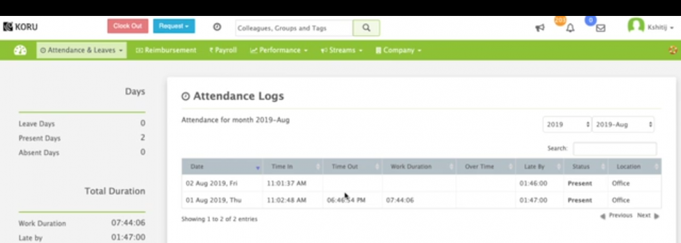
- Redundant sub heading as the list boxes on the right already show the selected month/year. This is an example issues that arise due to lack of communication design inputs.
- the drop downs / list boxes are far away from the sub heading to create a proximity association, necessitating redundancy of the title. Not good UI design.
- Do we really need two drop downs to select year/month? Wouldn’t a date component do a better job with better usability?
- Why does month selection drop down has year as well?
- Not clear why there is a search box. By design only a months worth of records can be displayed (due to the drop downs), which means showing 20 to 25 rows at max, making the search box necessary. If its a global search box then too the search box is redundant and not required as there’s a global search box in the header.
- For the same reason, next/previous buttons seem unnecessary for such a small list of items. They also look as if they are in active state, for a list with no pagination, these should have been at least in disabled state. And they are misaligned to boot!
- Time stamps have been unnecessarily been made too complex by including seconds. Besides, this time scheme is not used elsewhere in the system bringing in inconsistency.
- Same with date format. The user already knows, moth and year, is this information being repeatedly shown in the listing? All in all, this is a poor choice of format.
- Assuming this is the default screen when you come to this page, shouldn’t it display this fact? Further, since the users have to typically update previous months attendance, shouldn’t this page display the same or at least a list of days that need to be reviewed by the user?
- There is no way for the user to request attendance regularization from this page. Seems like an obvious option to me. A simple edit button should suffice.
- Status column makes little sense. After all, when a user is absent the row for that day can be disabled or visually different (no login/logout times, etc), so why have this column?
Attendance Request popup
- For such a core taks, popup interface seems odd, especially because this potentially a multi-step complex task. Poor interaction design.
- Web clock-in seems like an important task, should it be hidden inside a popup?
- Poor selection of default value for Location field as most people can be safely expected to work from office by default.
- The date label “01” is unclear and doesn’t communicate what its for. Lack of proper copy and poor labelling. Same issue with “Add More” link.
- The user said, he forgot to Clock-out on 5th, so the “Clock-in Time” should be have been automatically populated by the system with his clock-in time as soon as he selected the date. Same when a user simply wants to update/fine-tune his timing. This could save a lot of steps at the organization level as well as reducing data corruption/inconsistency issues.
- No cancel button.
- The date picker does not give the affordance of a date component.
- The time picker components are not standard and too complex. Any modern date/time picker component would do a better job with vastly improved usability. Also, time format in these fields are different from the logs view page. That's bad either stick to 24 hour format or AM/PM.
- The time entry fields for hours and minutes have default text as “--Select--” instead of “hour”, “minutes”. Bad usability.
- Any why is the user made to enable these fields? Aren’t these mandatory fields!
- The heading “Overnight Clock-out” seems redundant, the check box component and its label give sufficient explanation.
- Message field is mandatory but has no indication for the same.
- No visual separation between form/apples for different days. Its a minor point but can be important if the user has to work with multiple days. Poor usability/visual design.
- With the addition of multiple days, the popup becomes harder to navigate, especially by keyboard and also looks too complex.
- The “X” button used in the applets is to remove that day from the form (I am assuming), but this is bad affordance. Such buttons are usually used to close components, especially when placed in the upper right corner. Also, the small size of the button is bad for usability (Fitts law).
- Furthermore, it clashes with the close button of the popup itself!
- Listening to the user/narrator it seems that the form discards already entered data when there’s an error. This should not happen in a well designed application.
- The system does not reflect how things are already done in the organization. For example, in date “03”, upon form submission, the system informs the user that this date has already been approved. This will never happen in a properly researched and full automated system.
- In the above example, “03” the narrator is not sure if the above is system mistake, a miss communication or human error. This shows lack of proper system research and consequently lack of automation and proper feedback.
Thanks it!
Away shirts can give supporters a different way to remember important matches as the difference between authentic and fan styles can shape how a shirt is used. Fans comparing Bundesliga shirts often look at the relationship between team identity, design, and tournament pressure. For collectors looking at classic seasons, Benfica football shirt remains a natural topic when the focus is on design, fit, and supporter meaning. This kind of comparison turns colours, badges, and fabrics into part of a larger football story.